How to create or make charts with automatic update in Excel
With Excel you can work as simple as making an Excel spreadsheet to calculate rental prices. Even more difficult operations such as using the hyperbolic CSCH functions in Excel.
One of them is the possibility of automating the change of information in a table that has been created from data established in the document. This, despite seeming complicated, is very simple and easy to do, as long as the instructions are followed carefully and to the letter.
How can this tool help me?
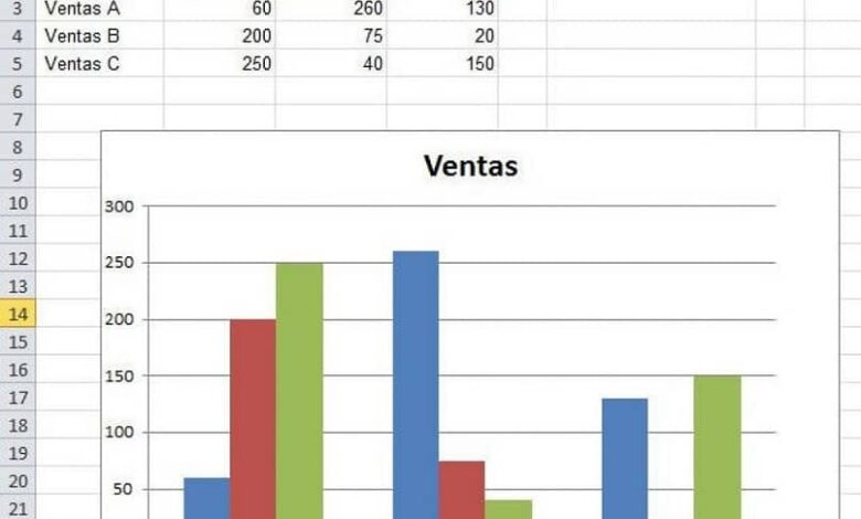
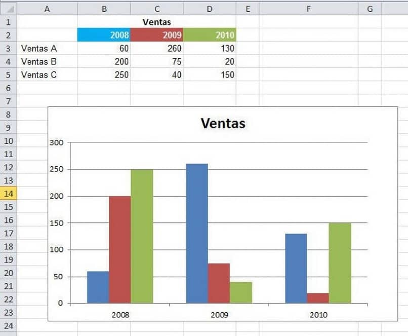
It is very common to keep records of sales or purchases in an Excel workbook, which, to be more technical, is accompanied by a graph. In general, said graph gives a visual and digestible touch , for certain people, to the information that is reflected in the table.
But it is quite annoying to have to change the data in the two structures in parallel every time some value is updated. For this reason, Excel offers the possibility of creating, from the table with the information that it has, a kind of graph with automatic updating.
In this way, when changing information from the source of the data, which would be the table, it will be reflected in the same way in the attached graph, saving a great amount of time and effort.
The reason for turning off or disabling automatic updates in Microsoft Office must be a really good one. Especially since with each new edition, better useful tools are added.
Step one: create the table
The first thing to do before inserting the automatic update graph is to create the table with the data that will be reflected in it. For this, it is necessary to establish the data that will go into it. First of all, the first row should be used for the headings.
Likewise, the information of each of them must be organized in rows and columns, and each of them must have the same format (numbers, texts, date, currency, among others).
In this sense, each cell must contain an individual data or a single record (that is, there cannot be, for example, two dates in a cell). Once the data has been organized, the table can be created by selecting any cell that contains data.
Then, we select the command “Insert> table ” and immediately, the program will identify the perimeter of each of the data. A box called “Create table ” will appear and you have to make sure that the reference it shows matches the range of the data.
Similarly, in that window there will be a box that will say “The table has headers.” This itself must be marked. Then press “OK “. In this way, if the information and cells were organized correctly, the table will be created successfully.
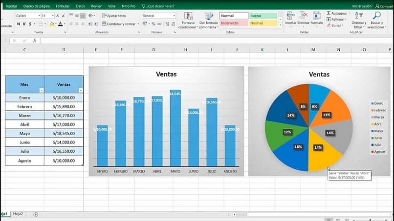
Create auto update chart
In this step, with the table created and the data organized, you only need to create the automatic update chart from the “Insert ” tab . In the graphics section a series of varied styles of them are shown, we just have to choose the one that best suits what is requested.
It is important to bear in mind that not all types are used for any reason, there are some that are more suited to a situation or job than others. Then, when selected, it will be attached to the spreadsheet taking as a reference the data from the table that was established earlier.
From here, each time the values are updated, the changes will be automatically reflected in the inserted graph , even if new data is added, it will be modified to accommodate them.